Designing emails can be a tricky business. With the world turning to interactive emails and video content, “electronic direct mail” can be a minefield for the small business owner, who is often not a coder.
Fortunately, the market place is full of great solutions, such as Mailchimp or Campaign Monitor, which help you get your message to your fans, and often provide ready-made templates for you to choose from.
Once you have purchased a subscription to your preferred email platform, and you have opened up the drag-and-drop editor screen, what’s next?
To combat creative block and remove anxiety, we have put together ten tips for excellent email design. If you stick with these Bold hacks, you will be on the right track to email design success.
Bold Tip #1 – Keep your layout simple
Too many columns in an email look ugly and confusing for your reader. Most emails use one or two column layouts. Don’t go beyond three unless you want to showcase your images side by side.
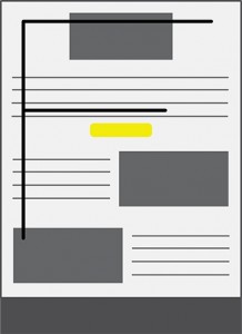
Bold Tip #2 – Create an invisible F-shape with your email elements.
When we read content, our eyes naturally scan in the shape of an “F”, so the main focus of your email should be in the top left of the email. Start your sentences with enough information to hook your reader in, or an eye-catching banner image.
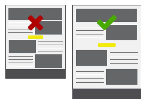
Bold Tip #3 – Give it space
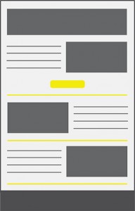
Great design is not only accomplished by selecting beautiful images to embellish your text. It’s also in the “breathing space” that surrounds each element, acting like a photo frame. Designers call this “white space” or “negative space” and it is often the difference between an email that looks well-designed and amateurish. To achieve a modern feel to your email template, leave extra pixels around text, call-to-action buttons and images.
Bold Tip #4 – Keep it separate
Like paragraphs, divisions between sections of an email separate content items. In a newsletter email you will want to showcase different news items or blog posts. Here are some of our favourite ways to split your sections up:
1. Dividing lines
The simplest ideas often make the most impact. Just a simple line or horizontal rule in your brand colour can lend an attractive aesthetic to the rest of your content.
2. Adopt colour-blocking
Contrast the backgrounds of the various sections using different colours. Email and website designs using this tactic often seem more playful or approachable as the content is easier to digest.
3. The zig zag shape
Alternate the text and copy in each section so it appears as a zig zag. This creates a quirky effect that guides the eye along and down the email.
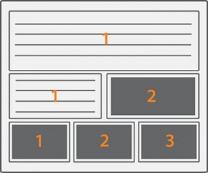
Bold Tip #5 – Be square
Everyone loves images arranged into tiles for a contemporary twist – It’s everywhere on the web, so don’t be afraid to experiment with your content blocks in email. Think images, quotes and other text elements in an asymmetrical format. Email blog Really Good Emails describes it as “Play[ing] Tetris with content.”
“The nice thing about boxed content like this is that it scales up and down nicely in responsive designs.” – Really Good Emails
Bold Tip #6 – Be colourful
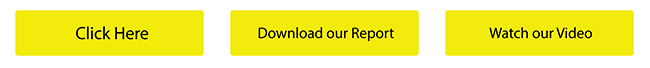
Highlight headings, call-to-action buttons and links in your brand’s most eye-catching colour. They draw the recipient’s attention to the most important elements. This is usually where you would like your reader to click or tap.
Bold Tip #7 – Be font-tastic!
There are two considerations with type: one is size and one is style. A good rule to go by is to use a font-size of 14px or greater. Make sure your line height is about 21px for a 14px font-size, so 1.5 times bigger than your font.
As for style, it’s all about the contrast, so mix serifs with sans serifs, bold weights with lighter weights, and large type with small type.
NB: Avoid Comic Sans – It’s not that it’s a rule, we just hate it.
Bold Tip #8 – Include images
You can use jpeg, png and gif file types in your emails. Animated gifs can liven up emails, so if you want to, include them. Remember to include alt text as this helps your email reach the inbox and enhances the experience for people relying on screen readers.
Bold Tip #9 – Make it actionable
The whole point of the web is that you can link from one page to another. If your email doesn’t include a call-to-action, then it’s not helping drive traffic to your site or encouraging conversion in any other way.
Here are some best practices for a click-worthy call-to-action button:
1. Litmus suggests 44px by 44px as the minimum size for mobile email buttons due to the average thumb size.
2. On mobile phones, it is a recommended your button spans the full width of the screen.
3. Include a call-to-action at the top and bottom of long emails so readers don’t need to scroll in order to click through.
4. Style your button with a lively brand colour and use padding around the button’s text for comfortable clicking.
5. Don’t forget about using whitespace!
Bold Tip #10 – Be concise
The email is the amuse-bouche; your website is where you want people to luxuriate over your content and find other engaging articles. No one wants to scroll for an age down a wall of text. Instead, link from your email teaser text to the full article on your website. Unless it is a newsletter email with lots of short items, keep it short and sweet.
Creating HTML emails can seem an impossible feat when it’s often left to someone in the office who is not a designer by trade. Yet with these pointers and a good email editor, you will be able to put together a professional looking template in no time.
Keep checking back for more Bold design and marketing tips as we uncover the latest trends and best practices.